Color influences our emotions even before we become aware of it. It affects our mood, self-assurance, and our experience of daily environments. In the realms of luxury interior design and fashion, color has evolved into a subtle form of communication.
It mirrors how societies react to ambiguity, comfort, and transformation. Rather than seeking shock, the color schemes of today appear more deliberate. Soft neutrals, gentle pastels, and earthy hues indicate a longing for emotional clarity over visual chaos.
Pantone stands at the forefront of this evolution, translating cultural sentiments into color narratives that flow between fashion and home decor. Items found on a modern shelf frequently reflect what appears on the runway, merging our attire with our lifestyle.
Color transitions from being merely trend-focused to crafting environments and apparel that feel purposeful and enduring.
Pantone as a Cultural Guide, Not Just a “Color of the Year”
Pantone has subtly evolved from a trend predictor to a cultural interpreter. It transcends the act of selecting a single shade and labeling it the color of the year. Pantone perceives the atmosphere. It observes how individuals live, shop, travel, and dress, converting those insights into color narratives that resonate emotionally.
These color palettes manifest across fashion catwalks, living spaces, and even technology design, showcasing how we desire our environments and wardrobes to convey a sense of comfort. In a rapidly changing world, color serves as a form of solace.
Why Home & Fashion Are Drawn to Identical Colors
Both home and fashion interact with the same hues because they fulfill equivalent emotional needs. Our clothing and living spaces are both extensions of our identity, comfort, and mood.
In times of uncertainty, softer neutrals and grounded tones become prominent as they evoke stability and familiarity. As optimism returns, colors take on a more playful character. Designers in both home design and fashion connect with these universal emotional signals.
This synchronization explains why identical shades appear on sofas, walls, coats, and accessories all at once. Color permeates culture first, subsequently making its way into our wardrobes and homes nearly at the same time.
Dominating Pantone Trend Colors
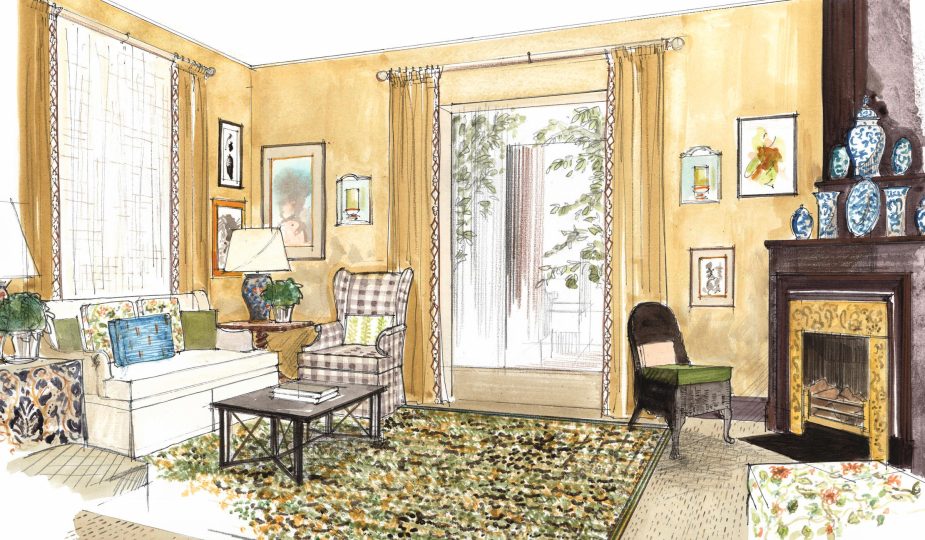
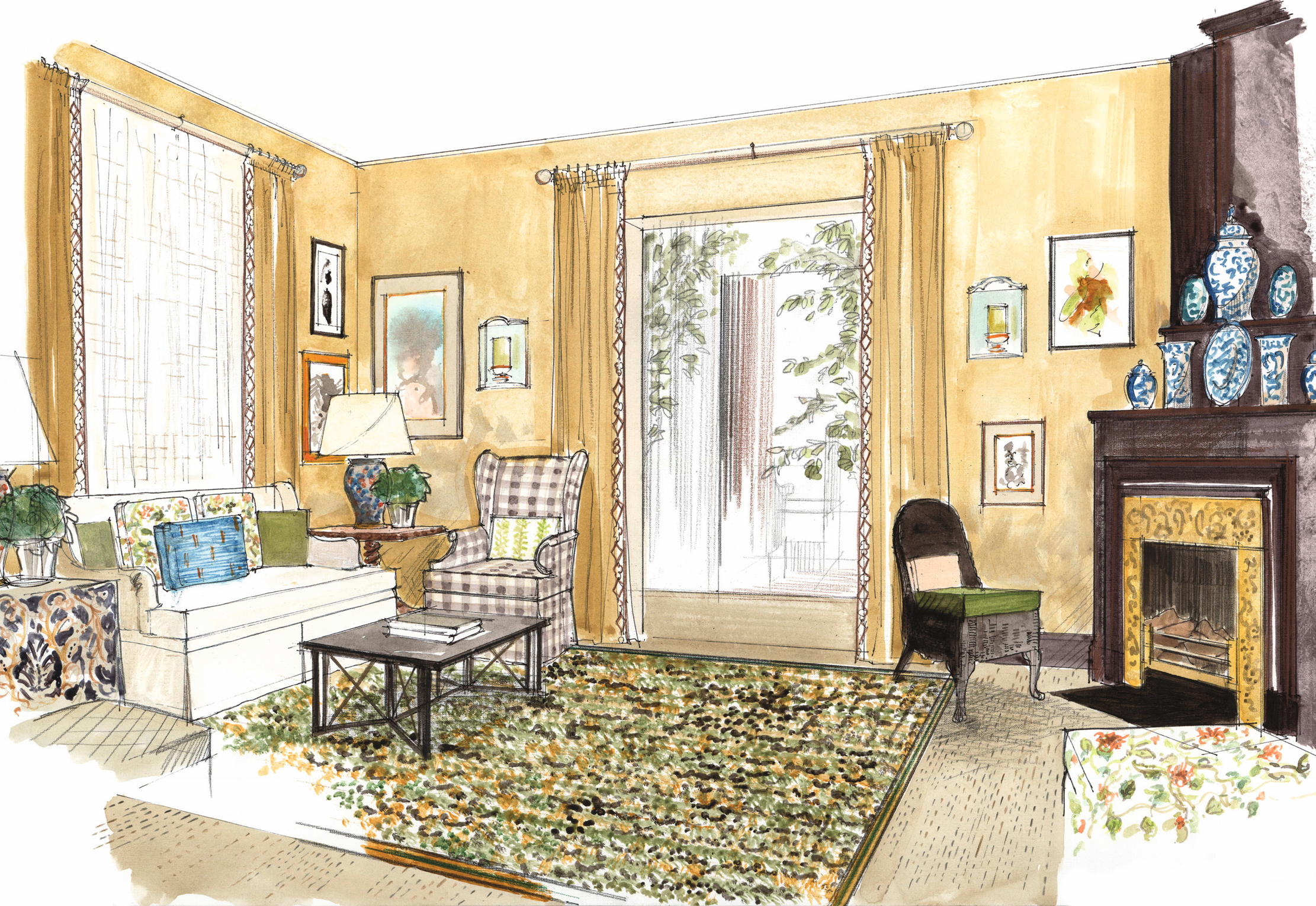
New Generation Warm Neutrals
Beige has evolved from being mundane. Contemporary neutral tones are trending towards warmth, featuring hints of sand, oats, and baked milk. These shades are often linked with tranquility and visual comfort.
Research in color and environmental psychology indicates that softer, warm neutrals usually appear less visually jarring than cooler gray shades.
In interiors, this is mirrored in walls, ceramics, and sizable furnishings. In fashion, it is seen in relaxed fits, outerwear, and knitted garments.
Dusty Pastels Over Bright Hues
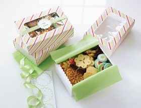
Pinks, blues, lavenders — but with a sun-faded quality. These colors foster subtle interactions instead of being overtly striking. They are especially favored in bedrooms, bathrooms, and loungewear.
Notably, these pastels are frequently selected by brands dedicated to self-care, spanning from cosmetics to home textiles. Color signifies a sense of emotional safety.
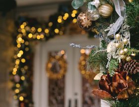
Rich Natural Hues
Envision moss green, terracotta, deep ochre, and dark blue. This palette responds to digital exhaustion. Amid too many screens, the human eye seeks depth over brightness.
Such colors are typically applied to specific areas in interiors: accent walls, couches, or closets. They also appear in outerwear, shoes, and bags within fashion. They evoke a feeling of earthiness, even in high-rise apartments.
How Pantone Affects Real-Life Choices, Not Just Design Moodboards
In the Interior: Color as a Behavioral Framework
Colors define style and influence the ambiance of a space. Warm neutral shades promote social interaction, making them popular in living rooms and kitchens. Richer, deeper colors are reserved for environments requiring focus or rest.
Interestingly, designers have observed that clients are increasingly requesting colors that remain appealing for extended periods, rather than those that are immediately eye-catching. This indicates a shift from visual impact to a focus on physical reactions.
In Fashion: Versatility Over Seasonal Trends
In fashion, Pantone trends are moving toward adaptability rather than strict seasonal classifications. Colors are now designed for year-long use, suitable for layering, repeating, and evolving. A warm neutral coat or muted pastel knit feels appropriate in both fall and spring. Versatility becomes the new luxury.
Why We Trust Color So Instinctively
We trust color because it communicates before we articulate anything. Long before trends, logos, or words, color influenced our perceptions of safety, warmth, and emotions. It operates on instinct rather than through rational thought, establishing an immediate sense of honesty.
A gentle neutral conveys calmness without the need for justification. A rich green exudes stability even before it’s named. Brands, designers, and environments utilize color for its ability to bypass excessive contemplation, connecting directly with our instinctual responses.
In a world inundated with choices, color streamlines decision-making. It allows us to experience a feeling quickly and trust its authenticity.
The Future of Pantone Trends: Upcoming Color Directions